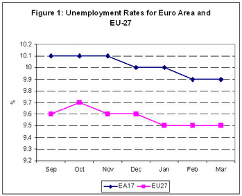
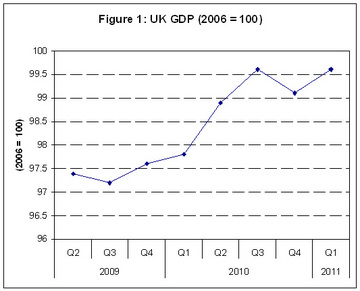
Euro level unemployment is at a rate of 9.9% in March 2011. This is down from 10.1% in March of 2011. Comparably, the EU-27 unemployment rate has fallen from 9.7% to 9.5% over the same time period. This decline in unemployment figures, however small, is a positive event. As shown in Figure 1 the downward pattern has been prevalent since September of last year. 
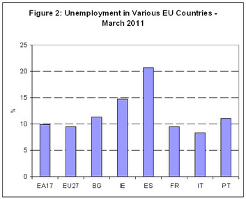
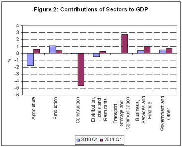
Comparing Ireland to some of our neighbours we are faring particularly poorly when it comes to unemployment figures. This is highlighted by Figure 2 which presents Ireland and a number of our European counterparts for whom data is available for March 2011. We can see that with the exception of Spain (ES) Ireland possesses one of the highest unemployment rates in Europe. As Ireland was coming from one of the lowest levels of unemployment in Europe in 2007, this highlights Ireland’s dramatic fall.
2 Comments
Preliminary figures from the CSO indicate that GDP and GNP in Ireland continued to fall in 2010. GDP contracted by 1% over the year while GNP fell by 2.1%. These falls are lower than the decline in 2009 and 2008 but are still worse than hoped for. Most forecasts at the beginning of the year predicted GDP to grow at a rate of 0% (i.e. show no change). Figure 1, however, clearly indicates the decline in both GDP and GNP. It can clearly be seen that since the peak in 2007, GDP has now fallen by 11.8% and GNP has fallen by 15.6%. If we break this change down by sector we can see the main factors driving this decline. Figure 2 presents the contribution of various sectors to total GDP. This graph compares Q4 2007 to Q4 2010. It can clearly be seen that all sectors are producing less output than previously with some sectors falling sharply and others contracting slightly. It must be noted when analysing the graph that Construction is a subset of industry, therefore, some of the fall in industry production can be explained by the fall in construction. When we consider in Figure 3 the percentage change between Q4 2007 and Q4 2010 we can see that the largest fall was observed in Construction, with output falling over 55%. While most other sectors experienced a fall of between approximately 10% and 15% with the one exception being agriculture which has seen a fall of only 1%. It can clearly be seen that while Construction has contributed significantly to the fall in the overall economy, it is far from the only sector experiencing dramatic decline.
According to the UK Office of National Statistics in their latest update UK Gross Domestic Product (GDP) has increased by 0.5% in the first quarter of 2011. This increases makes up for a fall in GDP in the last quarter of 2010 (where GDP fell by 0.5%). This rebound can clearly be observed in Figure 1. However, as the growth in Q1 2011 has only made up for the ground lost in Q4 2010, this suggests that UK GDP has remained relatively unchanged since Q3 2010. This may suggest that any talk of rapid economic recovery in early 2010 may have been unfounded. With growth essentially being static from Q3 2010 onwards. When we break down the causes of Growth in Q1 2011 (comparing them to Q1 2010) in Figure 2, it can clearly be observed that the construction sector continues to decline rapidly. While Transport, Storage and Communications has moved from static growth in Q1 2010 to rapid growth in Q1 2011. Indeed it appears to be the services sectors which are driving growth with Business Services and Finance also growing rapidly. Agriculture and Production (manufacturing) are also growing. This general growth across the economy (with the notable negative construction effect) is encouraging. Growth appears to be arriving through a number of channels as oppose to being concentrated in any one particular of the economy suggesting that the growth achieved may be robust to any shocks in different sectors.
The latest release from the CSO’s live register suggests that unemployment (as measured using the Quarterly National Household Survey Methodology) is holding steady at 14.7%. However, the live register figures which were released by the CSO, while not precise measures of unemployment as they account for people who are engaged in part time employment and seasonal and casual workers, can provide an insight as to what is happening within this 14.7%. Using the live register it is possible to gauge general trends in the labour force. Here we will break the live register down by gender, age and previous occupations. Figure 1 shows that the majority of people represented on the live register are males. This is unsurprising given the predominance of male workers in the construction industry prior to the collapse in this sector of the economy in 2008. Males now make up almost 75% of those registered on the live register. Figure 2 shows teat the proportion of those on the live register aged under 25 is remaining constant at approximately 25% of the total number of the live register. This suggests that the recent increases in the number of people on the live register derive from individuals aged over 25. Interestingly, when we break down where people worked before signing onto the live register we can see a marked difference between male and female workers. Figure 3 and 4 show that for males most individuals are signing onto the live register from Craft and Related industries while for females most individuals are signing onto the live register from sales and personal and protective services.
This is a copy of the slides I presented to the 3rd Business Statistics Seminar held by the CSO on the 23rd of March 2011 in Dublin Castle. The presentation focuses on sectoral differences in innovation performance. The results indicate that for two types of innovation (new to firm and new to market product innovation) the drivers of innovation vary dramatically across sectors. However, for organisational and process innovation there is no significant difference in the drivers of innovation performance. The paper points to the need for more focused innovation support from policy makers and emphasizes that a one size fits all policy is not appropriate. Doran and Jordan 23 3-2011 View more presentations from doran_justin Exports have risen in February of 2011 increasing by 11%. However, over the same time period imports have actually decreased by 3%. It can be seen in Figure 1 that exports in February of 2011 are substantial higher than they were in 2010. This indicates a strong performance by Irish exporters, and is a turnaround from a dip in exports in January 2011. This slight dip in exports in January 2011, coupled with an increase in imports, resulted in Ireland’s trade surplus decreasing slightly. However, due to rising exports, this has trend has been reversed and in February Ireland’s terms of trade surplus increased to €3.8 billion.
The latest release of the Consumer Price Index (CPI) from the CSO suggests that prices in Ireland are on the rise. From March 2010 to March 2011 the overall price level in the economy has increased by 3%, with March 2011 seeing a 0.9% increase in prices. But what are driving these price increases?
Looking into the figures it is notable that a number of categories have been driving the rising prices over the last year. One of the biggest increases was observed in the Housing, Water, Electricity, Gas and Other Fuels category. This category measures the amount which s rents, mortgage interest repayments, local authority service charges, goods and services for maintaining, decorating and repairing dwellings and domestic energy products such as electricity, gas and solid fuels increase or decrease. In total this category increased by 12.5% in the year to March. This is not good news for house owners as it reflects the higher mortgage repayments they have had to make due to increase in the interest rates charged by banks. Likewise, it reflects the increases in prices in domestic fuel consumption which places additional pressures on home owners. Increases have also been observed in the transport category which covers the purchase of new and second hand vehicles, spare parts, car maintenance, fuels and lubricants, public transport and services such as parking, motor association subscriptions, car wash, toll charges, driving tests, licences and car hire. This has increased by 4.1% in the last year reflecting the increased charges in public transport, parking and driving tests. While the price of food and non-alcoholic beverages, purchased in supermarkets, small shops, speciality shops and petrol station forecourt outlets but excluding meals out which are covered under Restaurants and Hotels, has increased by 1.6% the price of restaurants and hotels, which covers meals in restaurants and hotels; fast food and takeaways; cafes; canteens; alcohol consumed on or within a licensed premises and accommodation services supplied by hotels, guesthouses and hostels, has fallen by 1.3%. This suggests that supermarket prices are on the rise while prices in restaurants are still falling. Overall, there is an upward trend appearing in prices, however, the areas in which there are increasing prices appear to exist in areas where individuals are currently under financial pressure such as in the mortgage sector. With the European Central Bank expected to increase interest rates in the near future, this suggests further increases in the costs of mortgage servicing. There is a lot of discussion in the media about bonds, bond yield and the negative implications these have for countries. But what do these terms actually mean and why are they important and worrying for Ireland? Bonds are essentially a contract between a government and an investor. Generally, they are assumed to be one of the safest forms of investment. They are also a major source of income for governments seeking to raise funds. An individual invests an amount with a government, lets say €100, and in return for this they will get a fixed interest repayment for a period of years, lets say 5% a year for 10 years. At the end of the investment period the investor will have received the yearly interest payments and will also receive back his initial investment. So he will receive €5 a year for the 10 years and at the end of the 10 years he will get back his €100.
However, the individual has the choice, rather than holding onto the bond for 10 years, of selling the bond. He can do this on the bond market. However, the price he will get for the bond will not always be the same as the price he paid for it. Lets take Ireland as an example. There are now doubts as to whether Ireland will be able to repay its bonds. Essentially making people who own the bonds unsure as to whether they will get their money back at the end of their investment. Understandably, this makes these people concerned and makes the bonds less valuable as they may not be worth the full value. Therefore, on a bond market they may be sold for less than the initial investment, so the €100 bond may be sold for €50. Bad new makes the value of bonds fall. Good news makes the value of bonds rise. However, someone who purchases the bond at €50 from someone who had initially paid €100 still receives the same rate of interest. So as the interest was 5% on €100, even though the bond has been re-bought for €50 the new owner still gets the benefit of the 5% interest on the initial €100 investment. This is where bond yields come in. Effectively, the yield, or return, on the bond is now 10%. This is because the individual is receiving €5 a year (5% of €100) for a €50 investment (essentially yielding 10%). Therefore, as Irish bonds would yield a return of 10% on the market when the Irish government reissues more bonds, in order to make them attractive to investors, they must sell them with an interest rate close to the yield on the market. This process has resulted in the developments which have been observed in the Irish bond market. Initially, yields on Irish bonds were low because during the Celtic Tiger and construction bubble there was little doubt in peoples minds about Ireland’s ability to repay its debts. However, as the economy declined and the government failed to control its budget balances, this resulted in investors getting nervous about the ability of the government to pay them back. This developed over time until Irish bond yields climbed to over 8% towards the end of 2010. As the amount we had to pay increased. Investors thought it increasingly unlikely that we would be able to repay our debts and the crisis became a self reinforcing problem. This continued until Ireland was bailed out by the EU and IMF, effectively providing us with sufficient funds so that we would not have to go to the bond markets for funds and providing their funds at a much lower rate than the market was demanding. The latest figures from the CSO suggest that the pattern of emigration from Ireland is continuing and is increasing in pace. Looking at Figure 1 it is clear that the decline in the number of people emigrating which occurred during the Celtic Tiger and the subsequent construction bubble has well and truly reversed itself. The level of emigration in 2010 was almost as high as it was in 1989, with an estimated 65,000 people leaving the State. The opposite pattern is occurring when immigration is occurring. The vast number of people entering Ireland during the economic boom has fallen off sharply. This has resulted due to changes in the jobs market. When employment was plentiful, there was an increase in the number of people entering Ireland, which filled the need in our labour market, However, as Figure 2 shows, as the market has contracted, less and less individuals are coming to Ireland. This has had a dramatic effect on our net emigration. This net figure is the number of people who are entering Ireland minus the number of people who are leaving. Historically, Ireland has suffered with net emigration, with more people choosing to emigrate as oppose to coming to Ireland. This is due to Ireland’s continuing failure to provide sufficient employment for its population. This trend was reversed in the boom years, with more people actually coming to Ireland than leaving. However, net migration has been falling since 2007, turning negative in 2009 and remaining negative in 2010. This is a sign of Ireland’s economic decline. Again, we are returned to a position where there is insufficient employment to meet the needs of the population, and as a result emigration is occurring.
The number of new cars sold in January 2011 was up 30% on last years figures while February 2011 also proved to be a good month for car dealerships as sales increased by 15% on last February. Figure 1 displays the total number of new private cars licensed per month from January 2009 to February 2011. While the seasonal pattern of the industry can clearly be observed in the graph it is clear that each year since 2009 has seen an increase in new cars licensed. In 2009 only 54,000 new cars were licensed however in 2010 this figure increased to almost 85,000 and already this year new car licenses have reached 27,000. These increases would appear to be the result of the government’s move to introduce scrappage for new cars when trading in a car 10 years or older. If this is the case we can undoubtedly deem this policy intervention a success. The numbers of new car licenses proves this point. However, what is the benefit of this policy to Ireland?
Two positive externalities were identified as arising from the introduction of the scrappage scheme. Firstly, that it would save Irish jobs in the car dealership sector. This would prevent further job losses and additions to the dole. Secondly, it was also to provide a mechanism through which individuals would switch from older, more polluting cars to modern, more environmentally friendly cars. However, are these really worth the government getting involved to artificially support a market? The reason why the car dealership industry was struggling was due to the current economic downturn and subsequent decline in disposable income available to the Irish population. This has general implications for a number of industries across the economy. However, Irish car dealerships have been singled out for specific, advantageous treatment. Why is this the case? Presumably it is because they have a powerful lobby group with which to put forward their arguments to policy makers. The intervention in the market is keeping dealerships open which would not have been able to survive without government support. However, what will happen when this support is removed? Will the dealerships still be able to survive? If not, then the support is providing nothing more than a short lived reprieve. The levels of consumption and spending experienced during the Celtic Tiger were unsustainable and will not be available to Ireland again in the future. Therefore, it could be argued that the intervention in the car dealership market provides little long run economic benefit. |
AuthorJustin Doran is a Lecturer in Economics, in the Department of Economics, University College Cork, Ireland. Archives
December 2017
Categories
All
|