The latest figures released from Eurostat indicate that Ireland’s construction demise has been among the worst of all the EU-27 countries. Figure 1 shows this decline compared to the European average and some other selected countries. Using 2005 as the base year of 100, Ireland’s construction output has fall by 73%. This fall is far in excess of the European average which has seen a fall of only 13%. And while the Euro Area has been more adversely effected than the rest of Europe this has only fallen by 18%. Germany’s construction output is actually higher in Q4 2010 than in was in 2005 while the UK has seen improvements in construction output throughout 2010. 
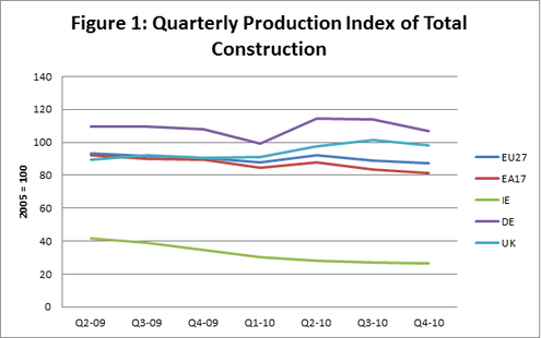
These figures indicate that while Ireland is not the only country to be adversely effected through a collapse in the construction industry, we appear to have suffered more than most. Perhaps indicating the extent to which the construction industry in Ireland had overheated.
5 Comments
The latest index of house prices released by the CSO shows that house prices have continued to fall up to the end of March 2011. This decline has shown no slowdown with prices falling by an average of between 1% and 2% a month from their January 2005 price. While someone who purchased their house in January 2005 could have sold it at the height of the boom for an average price increase of 30.5%, the property is now worth an average of 21% less than the 2005 price paid. This is highlighted in Figure 1 below. Interestingly, when you look at Dublin versus the rest of Ireland it is possible to see that while prices rose faster and higher in Dublin prior to 2007, post recession prices have fallen faster and lower than the rest of Ireland. This may be due to the excessive development of apartment complexes in the Dublin area during the construction bubble, providing a large degree of excess supply which would have to be absorbed before prices begin to rise again.
Ireland is not the only country experiencing a decline in the construction industry. The latest figures released by the Office of National Statistics in the UK suggest that in the first Quarter of 2011 construction output fell by 4%. This is somewhat expected given the typical seasonal deviations in the construction data. And the figure is less worrying when noting that output in Q1 2011 is 3.4% higher than output was in Q1 2010. Suggesting that there may be signs of a tentative recovery in output in the sector. However, it is still substantially below the levels observed at the height of the industry in 2007. Figure 1 shows how, over the last few years, construction output has declined dramatically but in recent quarters is displaying something of a recovery. This is dramatically at odds with what is occurring in Ireland where construction output has been in a continual downward spiral. It can be noted that while in 2009 output floundered throughout the year, following a continual decline in 2008, from Q1 2010 improvements were observable in the output of the industry. This peaked in Q2 and Q3, as would be expected given the highly seasonal nature of this industry. The decline in Q4 2010 and Q1 2011 are likely the result of this typical seasonal variation and when figures are released in three months time for Q2 2011, provided that there is no major shock to the industry, it would be expected that the output would rise again. It will be interesting to observe however whether the output rises above that experienced in 2010 or whether, year on year, the seasonal peaks will be lower.
The BBC has produced an interactive map of some economic indicators for various EU countries. These are available here.
Consumer prices increased again in April, with a rise in prices of 0.4% during the month. This means that in total the consumer price index indicates that between April 2010 and April 2011 consumer prices have increased by 3.4%. This is a substantial increase, and a strong turn around from the deflationary process experienced post-2008 recession. When we look at what the drivers of the higher inflation rate are we can see that Housing, Water, Gas, Electricity and Other Fuels experienced the largest increase in price. This was followed by approximately 4% increases in Health, Transport and Communications. However, these were slightly offset by falls in the cost of Clothing and Footwear and Furnishing Household Equipment and Maintenance. Overall, these price increases are occurring in a lot of places where consumers would find it hard to cut back. For instance the costs of fuel for housing and health care. Likewise, increases in the cost of transport would have an impact through a number of channels on consumers.
Ireland is to get a reduction in the loan rate from the EU/IMF bailout package of approximitly 1% according to BBC news.
This reduction would be worth over €400 million to Ireland over the duration of the loan. It comes after lobbying from the Irish government since the recent elections. It should strengthen Enda Kenney's position and allow him to claim that he is fulfilling the promises he made in the build up to the elections that he would re-negotiate the loan rate. Euro level unemployment is at a rate of 9.9% in March 2011. This is down from 10.1% in March of 2011. Comparably, the EU-27 unemployment rate has fallen from 9.7% to 9.5% over the same time period. This decline in unemployment figures, however small, is a positive event. As shown in Figure 1 the downward pattern has been prevalent since September of last year. Comparing Ireland to some of our neighbours we are faring particularly poorly when it comes to unemployment figures. This is highlighted by Figure 2 which presents Ireland and a number of our European counterparts for whom data is available for March 2011. We can see that with the exception of Spain (ES) Ireland possesses one of the highest unemployment rates in Europe. As Ireland was coming from one of the lowest levels of unemployment in Europe in 2007, this highlights Ireland’s dramatic fall.
According to the UK Office of National Statistics in their latest update UK Gross Domestic Product (GDP) has increased by 0.5% in the first quarter of 2011. This increases makes up for a fall in GDP in the last quarter of 2010 (where GDP fell by 0.5%). This rebound can clearly be observed in Figure 1. However, as the growth in Q1 2011 has only made up for the ground lost in Q4 2010, this suggests that UK GDP has remained relatively unchanged since Q3 2010. This may suggest that any talk of rapid economic recovery in early 2010 may have been unfounded. With growth essentially being static from Q3 2010 onwards. When we break down the causes of Growth in Q1 2011 (comparing them to Q1 2010) in Figure 2, it can clearly be observed that the construction sector continues to decline rapidly. While Transport, Storage and Communications has moved from static growth in Q1 2010 to rapid growth in Q1 2011. Indeed it appears to be the services sectors which are driving growth with Business Services and Finance also growing rapidly. Agriculture and Production (manufacturing) are also growing. This general growth across the economy (with the notable negative construction effect) is encouraging. Growth appears to be arriving through a number of channels as oppose to being concentrated in any one particular of the economy suggesting that the growth achieved may be robust to any shocks in different sectors.
The latest release from the CSO’s live register suggests that unemployment (as measured using the Quarterly National Household Survey Methodology) is holding steady at 14.7%. However, the live register figures which were released by the CSO, while not precise measures of unemployment as they account for people who are engaged in part time employment and seasonal and casual workers, can provide an insight as to what is happening within this 14.7%. Using the live register it is possible to gauge general trends in the labour force. Here we will break the live register down by gender, age and previous occupations. Figure 1 shows that the majority of people represented on the live register are males. This is unsurprising given the predominance of male workers in the construction industry prior to the collapse in this sector of the economy in 2008. Males now make up almost 75% of those registered on the live register. Figure 2 shows teat the proportion of those on the live register aged under 25 is remaining constant at approximately 25% of the total number of the live register. This suggests that the recent increases in the number of people on the live register derive from individuals aged over 25. Interestingly, when we break down where people worked before signing onto the live register we can see a marked difference between male and female workers. Figure 3 and 4 show that for males most individuals are signing onto the live register from Craft and Related industries while for females most individuals are signing onto the live register from sales and personal and protective services.
Exports have risen in February of 2011 increasing by 11%. However, over the same time period imports have actually decreased by 3%. It can be seen in Figure 1 that exports in February of 2011 are substantial higher than they were in 2010. This indicates a strong performance by Irish exporters, and is a turnaround from a dip in exports in January 2011. This slight dip in exports in January 2011, coupled with an increase in imports, resulted in Ireland’s trade surplus decreasing slightly. However, due to rising exports, this has trend has been reversed and in February Ireland’s terms of trade surplus increased to €3.8 billion.
|
AuthorJustin Doran is a Lecturer in Economics, in the Department of Economics, University College Cork, Ireland. Archives
December 2017
Categories
All
|